Such a fan girl! Yesterday I was glued to my iPhone watching the live cast of Steve’s keynote. I’m a big fan of the iPod Classic because it’s the only iPod big enough to hold my entire library- I was relieved when I didn’t see them kill it (though I know it’s on the last spin!). All the updates are nice (particularly curious about the iPod Nano Touch), but iTunes 10… now we’re talking.

iTunes 10
Yesterday, the download was a no-show, so the first thing I did this morning was turn on the mac and hit update. First impression… Nice. I didn’t had to restart the mac to launch the app. Now to the good stuff. I’ve been an iTunes user since it’s public beta days. I’ve seen the icon change. The icon is not the best- we know it.
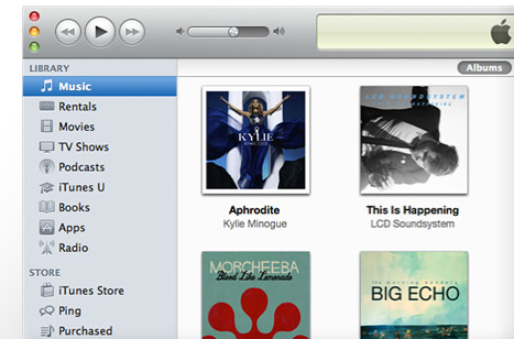
One thing I am really proud of is that I have a pristine and very organized collection. I’ve been building it since iTunes beta! I’ve grown to love the interface changes Apple has made, but this showing the Album Artwork only if it has more than 5 songs (medium preview)/3 songs (small preview) is not growing on me. I loved to see the album artwork- even if it was for a single song. But, on the other side, I can say that iTunes is loading faster.
On iTunes 10, the default view is list, without any artwork. When you change to List with Cover flow, I get the list view, but the compilations are off. That’s why I had Album by Artist/Year chosen as my “Sort by” mode- mistake #1 from Apple. I want to see the covers, yes, but also I appreciate if iTunes would show the albums as they were released! I get a new “Plays” column that I couldn’t care much about it- and they take away the Year column. It does matter to me the year that the album was released. Like I mentioned before, I have a very organized collection and I am proud of it. So, Year- mistake #2.
The interface all around does not bother me. It’s gray and dull but the Album artwork and now playing window get enough color on it. For me, it’s better since it’s focusing on the content (making it the star) instead of the interface visual aspects. The app definitely runs faster. Oh, and other thing, I removed my Last.fm plugin/App from the mac. It was slowing it down terribly and syncing would take forever. I deleted my account too- what’s the use of Last.fm if I can’t use it for free in Guate? And I’d rather listen to my own collection anyway.
When placing the iPhone on the dock, you see much smaller tabs on the top. The capacity graphic on the bottom is much simpler (don’t know if I like it or not). The only big change is the Apps Tab. Now, the App list is sorted by default by Kind (iPhone, iPod Touch and iPad, then iPhone and iPod Touch only). This is an update focused on the content of the App, making the application work for you- Your media.

Ping
I still can’t say I like it or hate it. There’s not enough interaction yet. The sign up process is pretty smooth. You get to fill up a profile: Name, user picture, small bio, and you either let iTunes tell you what are your top 10 choices of you can choose them manually- I chose that second one.
You can choose all from artists/songs that are on the iTunes store- it would be better if you could choose from your own library. I have some nice tunes from artists that are not on iTunes- Steve, better work on that, it will make the conversation much better!
It seems that not all the user pictures are being processed just yet, I still have a pre-set user pic. I started following a few people and bands. Nothing big. Let’s see what the final verdict is going to be in a few months.
All around, I liked the update. Now let’s see how intuitive and useful it really is!